Visual Identity, UX Design
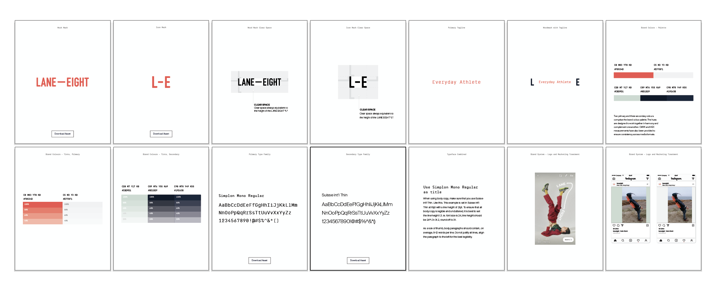
👟 LANE-EIGHT Visual Identity
Building the LANE-EIGHT brand with 2 co-founders, a brand strategist, photographers and art directors. I'm responsible for art direction, identity design, brand guideline, Instagram story and feed template, posters and wheat pasting design.
Credit
Creative Direction @maekan
Visual Identity @roywonghoyin
Studio Photography @cl.photo
Brand Strategy @jordanasarahterk
Lane Eight’s voice is refreshing for a sports brand, it doesn’t speak in terms that would alienate a specific athlete or a person who may not even consider themselves particularly active. It speaks to and for your everyday folk, sometimes with a touch of wit, always approachable and often clever.
In a performance space dominated by titans, a unique point of view and a storytelling approach can level the playing field for independent brands.There is opportunity for LANE EIGHT to apply a lifestyle approach bolstered with attention to technical details and materials, to create the perfect balance for a performance lifestyle brand.
How might we design a visual identity that redefines sport on our own terms. Stripping back the layers of the game to reveal the reasons why we fell in love with activity in the first place: connecting with new and old friends and feeling a sense of belonging.
1️⃣ Stage 1 - Art Direction and Research
We have distilled all our research and came up with a tagline, "Life in Motion". However there can be many interpretation for the brand, it can be contemporary, minimalistic or futuristic.
We started by gathering images on Instagram, images include photography, poster, instagram post, packaging and branding items such as business cards. We grouped them into 5 distinct art directions, and named them. We sent them off to the business owners and ask for their most idealistic option.

Feedback
Although the client did not really choose a single option for us, they circled the images they like and cross-out images they don't like across all 5 directions. We can still get a pretty clear idea of what they like.
We have distilled all our research and came up with a tagline, "Life in Motion". However there can be many interpretation for the brand, it can be contemporary, minimalistic or futuristic.
We started by gathering images on Instagram, images include photography, poster, instagram post, packaging and branding items such as business cards. We grouped them into 5 distinct art directions, and named them. We sent them off to the business owners and ask for their most idealistic option.

We sent them 15 options of the wordmark design we think that would work with the direction we came up with. They chose the option that has a dash between LANE and EIGHT. The dash symbolises a lane on a track field and connect people who loves sports.
3️⃣ Stage 3 - Iconmark + Applications
We then played around the wordmark and try to come up with a iconmark. We stretched the dash and bent it, tried it on images to see how far this dash can be to become an essential part of the brand. We came up with a very satisfied result when we tried it on Instagram story, it contains a lot of possibility and flexibility when it comes to presenting the brand.

We also venture outside the wordmark and tried other direction of using the dash. We made an iconmark with the dash, iconography and patterns that grew from the dash.